Category: design (Page 1 of 3)

Enzo Mari Perpetual Calendar

enzomari2
enzomari2
(http://www.flickr.com/photos/minhi/320670522/)
enzomari2” by minhi

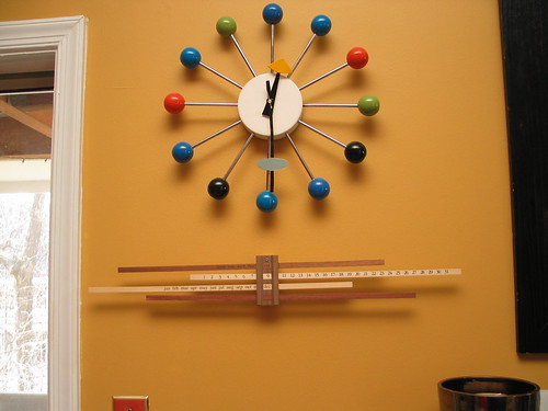
I remember seeing this calendar a few years ago, but the high price turned me off. Recently I’ve fallen for manual calendars for some reason, i like having to adjust it everyday. It may seem like more work but it’s no worse then marking off days on a paper calendar.

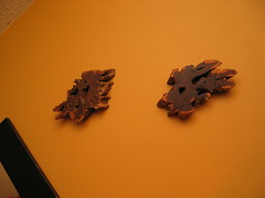
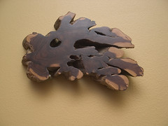
If you mount it firmly in place then it will remain steady as you adjust the bars. However I have it loosely mounted, so it swings freely. When I change the date every morning I have to use the bottom bar to re-balance the whole thing. It’s like balancing an old fashioned scale.

I love the changing shadows and how it visually changes everyday as you adjust each of the bars. The construction quality is disturbingly low for something this expensive–maybe it’s considered “charm” but everything fits together rustically (translation poorly, these are not high fit tolerances). I guess it’s part of the aesthetic, it doesn’t really affect the function and it means every one of these is somewhat unique. However it is so simple that someone with the right tools could copy this for about $10 in materials.

enzomari3
enzomari3″ by minhi

If you want one for yourself hivemodern.com sell one–but make sure you get one for your language, though I like some of the localized versions too bad they don’t make an asian language one like Japanese or Chinese characters. And for the record I bought mine from dwr.com when they were on closeout at a significant discount (they don’t sell them anymore) otherwise I would never buy it.

lamp inspired by vernor panton moon lamp


IMG_1787.JPG
Originally uploaded by minhi.

This picture is an excuse to play with my digital camera and long exposure times. If you’ve seen these lamps before they are a fun way to add some light to a room.

The “shell” is composed of pieces of plastic that pivot on the frame, you can create a full moon, half moon, quarter moon or anything in between.

This is not an original, it’s an inspired by original new. It doesn’t have a feel of an old piece which is my only real complain’t. I love the shadows it creates–though this picture is a dramatic example.

ikea wine rack


IMG_1814.JPG
Originally uploaded by minhi.

I know it’s been a long time between posts, more a problem with (lack of) inspiration then anything else.

This is to talk about the “VURM” Wine Rack from Ikea, you can find it HERE.
It is only $9.99 and is made from stainless steel i think.

I’m actually writing this for a cross post, but here’s a quick review of it.

I was drawn to this because of the my specific situation; tall and narrow. I also wanted something cheap and these are the cheapest wall hanging solution i could find.

So here’s the good
–cheap but functional, just what you expect from Ikea.
–design is stable
–neutral color
–cheap for a vertical wine rack!

And here’s the bad
–not uniform, so you can’t mount them end to end. the openings also are not uniform (more below).
–will not fit larger bottom bottles, i’ve noticed these are usually French, so champagne, French wine & cognac.
–if you remove and insert bottles often, you can scratch up the labels (might be important to some)
–not the cheapest option, especially if you have more space.

You might notice that I have a larger French wine bottle in the top slot. But that is the only slot I could get it into, the openings are not uniform and it is a super tight fit. The label is scratched up from squeezing it in there.

I also inserted some other bottles to show what will fit. The belgian ale bottle is at the limit of what will fit, but IIRC a Chimay might not fit. The vodka bottle fits no problem. Normally I wouldn’t store them like this but it’s nice that I can in a pinch.

And here are some cheaper but less versatile solutions from Ikea HERE

Overally I’m very happy with them, I might repaint them but the function is good. It solved my specific problem which was to take advantage of dead space in a corner.

Larger pic one

Larger close up pic

good ebay, bad ebay


IMG_1629.JPG
Originally uploaded by minhi.

if you look over my blogs you’ll see that i’m a big ebay user. like everything, if you’re careful with your spending you can make some good purchases. it’s not different then if you’re at a flea market or any old store–you have to have a good eye and know how much you want to spend.

But as well as i spend my money, sometimes i make not the best purchases. I would not categorize them as “bad” but they’re in the good deal category. So i’m going to review some of my home furnishing purchases and critique them for you.

Here we have a retro-mod clock from Sterling Noble. The listing was careful not to state it was old but at the same time did call it vintage so it was a smart listing. I knew it was not new so i ended up paying ~$22 total for it.

If you take a step back and think of it as just a clock that’s not too bad, an alarm clock at Target is around $15. And it would be difficult to find one of this design because this 50’s retro, jetson’s space age design is not popular anymore.

If you try to look at it as old or vintage then it’s a failure because it is neither those things.

But don’t look at it like that, it’s a cool looking clock that’s hard to find.

I rate this as an average buy, maybe a little better then average. It’s a cute clock and looks good in place.

the globe!


IMG_1632.JPG
Originally uploaded by minhi.

late for halloween. i bought this lamp on ebay as an impulse and did not relize how big it really is, it give’s off an goldish glow and when lit it looks pretty cool but i need to find a better place for it. click through to flickr for another picture. it was a pretty good buy price wise and it’s definately vintage!

nakashima-like art piece


wood1.jpg
Originally uploaded by minhi.

i bought a pair of these nakashima like art pieces on ebay for less then $20 for the pair. This is the nicer of the two, the other one is sun faded.

These had a nice story, came from a home of a famous executive, lots of mid century modern furniture pieces from eames, springer etc so these very well could be nakashima but i’m not aware of him making small pieces like this. And nakashima-like pieces are pretty easy to forge since he used natural organic forms it was hard for him to maintain a theme that you can identify.

They’re still nice art pieces for less then $20, better then generic stuff you buy at pottery barn.

finished remixed ball clock


IMG_1594.JPG
Originally uploaded by minhi.

And here it is finished. The hands are made from roofing flashing from Home Depot. It’s basically thin squares of aluminium that i cut into the approximate shape of the original ones.

The hands are more rustic then i would like, but i’m too lazy to make new ones right now. Surprisingly the $5 quartz movement is strong enough to move the minute hand–which is much heavier then the orignal one. This actually keeps pretty accurate time–well as accurate as you can get with a ball clock. The lack of minute markers means you’re always guessing at the time anyway.

« Older posts

© 2025

Theme by Anders NorenUp ↑