Author: mxgian (Page 14 of 24)

12-24-2006 run

.flickr-photo { border: solid 2px #000000; }
.flickr-yourcomment { }
.flickr-frame { text-align: left; padding: 3px; }
.flickr-caption { font-size: 0.8em; margin-top: 0px; }


12-24-2006.jpg, originally uploaded by minhi.

better. but still well over 10 minute mile pace. and i didn’t feel all that good.

sigh, can’t hide from the data

.flickr-photo { border: solid 2px #000000; }
.flickr-yourcomment { }
.flickr-frame { text-align: left; padding: 3px; }
.flickr-caption { font-size: 0.8em; margin-top: 0px; }


12-21-2006.jpg, originally uploaded by minhi.

I’ve been a little lax this winter about running, here’s my run data from earlier this week. My 5K time is still around 34 minutes, my PR from the summer is 29:45 so i’m a bit off from my best time. Having this much data is a blessing and a curse, you can’t hide from the data, it is what it is, time to train a little harder.

I use a Nike Triax Elite which records heart rate and speed/distance. It then syncs to your computer for data analysis. Nike does not promote it much anymore, the Nike+ iPod kit covers the speed/distance portion of this but they still don’t have a solution for tracking heart rate. The iPod solution does not work for me because I don’t like to listen to music while I run–I prefer it natural.

goblin market

.flickr-photo { border: solid 2px #000000; }
.flickr-yourcomment { }
.flickr-frame { text-align: left; padding: 3px; }
.flickr-caption { font-size: 0.8em; margin-top: 0px; }


goblin market, originally uploaded by minhi.

i found this place by accident back in october. I had just gotten back to nyc off the red-eye and was shopping in soho on a saturday morning. I realized i needed some breakfast and coffee and stumbled onto this place. I had read about it a few weeks before in the nyt and the name makes it easy to remember. It’s a pretty small space with a design similar to the little owl.

the bartender vicky was very nice, they had just opened so there were some service problems. i ordered a brioche (i think) french toast and it took a long time, better then 30 minutes to come out. But they served me an endless cup of coffee, the cups are small but i had 8 cups.

the french toast was good, the bill was $13-$14 before tip, which sounds like a lot for french toast and coffee but in-line with nyc and for soho. If i was in the neighborhood i would go back again but not necc. make a special visit.

espresso aida

espresso aida
espressoblends http://www.flickr.com/photos/minhi/320670301/
(espressoblends)
espresso aida” by minhi

After a few weeks of travel it’s back to my Solis SL-70 and some espresso. The options in Asia were a little weak so it’s been awhile since i’ve had anything good. I found this blend at Murky Coffee ($20 for a 12oz bag). It’s a custom blend they created for the South East Regional Barista Competition [yes such a thing exists, and i’m glad it does].

It’s an all middle america blend and i wish i knew that when i bought it. It’s a pretty good espresso, but it’s very hard to pull on my machine. When you nail it, it really represents middle america, bright, fruity and clean finish. In fact the finish is so clean it almost pulls the finish off the back of your tongue. It’s unique for sure, i’ve never had something so bright and clean. But you really need strong temperature stability in your machine. On the machines they have at the shop I’m sure it’s no problem but on my machine it’s not forgiving enough–bad shots come out sour.

The other minus, and something the murky guy’s admit to is that it does not work in milk. As a cap, latte or even a americano with milk it’s too sour. It doesn’t have enough back-bone to hold up with a lot of milk.

It’s nice to try something different, if only to understand what won’t work in my machine but i went back to the Toscano blend for my next bag. It’s also a lot cheaper! If you want to try it out you can also get them from Counter Culture Coffee online. The Aida blend is a limited edition one so at least try it for yourself.

Enzo Mari Perpetual Calendar

enzomari2
enzomari2
(http://www.flickr.com/photos/minhi/320670522/)
enzomari2” by minhi

I remember seeing this calendar a few years ago, but the high price turned me off. Recently I’ve fallen for manual calendars for some reason, i like having to adjust it everyday. It may seem like more work but it’s no worse then marking off days on a paper calendar.

If you mount it firmly in place then it will remain steady as you adjust the bars. However I have it loosely mounted, so it swings freely. When I change the date every morning I have to use the bottom bar to re-balance the whole thing. It’s like balancing an old fashioned scale.

I love the changing shadows and how it visually changes everyday as you adjust each of the bars. The construction quality is disturbingly low for something this expensive–maybe it’s considered “charm” but everything fits together rustically (translation poorly, these are not high fit tolerances). I guess it’s part of the aesthetic, it doesn’t really affect the function and it means every one of these is somewhat unique. However it is so simple that someone with the right tools could copy this for about $10 in materials.

enzomari3
enzomari3″ by minhi

If you want one for yourself hivemodern.com sell one–but make sure you get one for your language, though I like some of the localized versions too bad they don’t make an asian language one like Japanese or Chinese characters. And for the record I bought mine from dwr.com when they were on closeout at a significant discount (they don’t sell them anymore) otherwise I would never buy it.

try a change of perspective

.flickr-photo { border: solid 2px #000000; }
.flickr-yourcomment { }
.flickr-frame { text-align: left; padding: 3px; }
.flickr-caption { font-size: 0.8em; margin-top: 0px; }


IMG_1995.JPG, originally uploaded by minhi.

If you browse through my flickr pool, you’ll notice that i take a lot of pictures based on perspective. I could not get close enough to take a picture of this little statue up close, but from below it becomes interesting, it actually looks like the statue is holding up the tower.

If i could do it again I would have been more careful with the foreground focus issue, i think it’s a little distracting being too out of focus.

As an FYI (nearly) all of my pictures are taken with a Canon Powershot G3–which is 4 years old and “only” 4 megapixel. 4×5 prints are fine and for the web it’s more then adequate. That said I’m still shopping for a DSLR 🙂

if you take enough pictures…

.flickr-photo { border: solid 2px #000000; }
.flickr-yourcomment { }
.flickr-frame { text-align: left; padding: 3px; }
.flickr-caption { font-size: 0.8em; margin-top: 0px; }


IMG_2180.JPG, originally uploaded by minhi.

I have to admit that I did not mean to take this picture. When I took it, i didn’t realize it would be this interesting. i just wanted to take some pictures at dusk with the sun fading behind the island. It was dumb luck, i think the bright sun tricked the camera into a much higher shutter speed (1/2000) which made everything in the foreground extra dark. I also think there is something wrong with my camera where the color balance skews toward blue, maybe it’s the shutter speed, maybe it’s a defect in the camera (if you look at my flickr site, the picture after this one is orange and more correct to me).

Whatever the reason, it captured a really dramatic picture, the way everything is pitch black is great contrast to the pure white sun. Too bad i didn’t do this on purpose, i just wanted to get a cool picture of the sun setting, but i guess that’s part of taking pictures, following your gut even if you don’t know why.

Hello world!

Woohoo, was able to move to wordpress on a dedicated server! thanks jt! Now that i’m no longer under the thumb of wordpress or google maybe i will post more often 🙂 !

lamp inspired by vernor panton moon lamp


IMG_1787.JPG
Originally uploaded by minhi.

This picture is an excuse to play with my digital camera and long exposure times. If you’ve seen these lamps before they are a fun way to add some light to a room.

The “shell” is composed of pieces of plastic that pivot on the frame, you can create a full moon, half moon, quarter moon or anything in between.

This is not an original, it’s an inspired by original new. It doesn’t have a feel of an old piece which is my only real complain’t. I love the shadows it creates–though this picture is a dramatic example.

ikea wine rack


IMG_1814.JPG
Originally uploaded by minhi.

I know it’s been a long time between posts, more a problem with (lack of) inspiration then anything else.

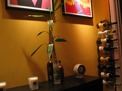
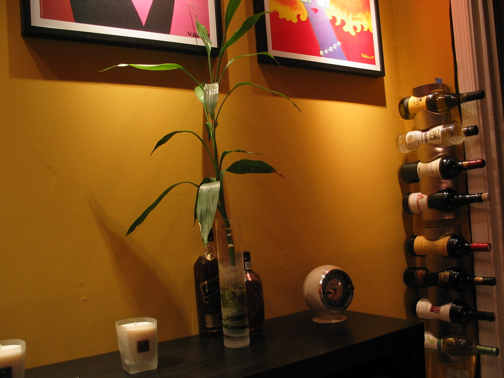
This is to talk about the “VURM” Wine Rack from Ikea, you can find it HERE.
It is only $9.99 and is made from stainless steel i think.

I’m actually writing this for a cross post, but here’s a quick review of it.

I was drawn to this because of the my specific situation; tall and narrow. I also wanted something cheap and these are the cheapest wall hanging solution i could find.

So here’s the good
–cheap but functional, just what you expect from Ikea.
–design is stable
–neutral color
–cheap for a vertical wine rack!

And here’s the bad
–not uniform, so you can’t mount them end to end. the openings also are not uniform (more below).
–will not fit larger bottom bottles, i’ve noticed these are usually French, so champagne, French wine & cognac.
–if you remove and insert bottles often, you can scratch up the labels (might be important to some)
–not the cheapest option, especially if you have more space.

You might notice that I have a larger French wine bottle in the top slot. But that is the only slot I could get it into, the openings are not uniform and it is a super tight fit. The label is scratched up from squeezing it in there.

I also inserted some other bottles to show what will fit. The belgian ale bottle is at the limit of what will fit, but IIRC a Chimay might not fit. The vodka bottle fits no problem. Normally I wouldn’t store them like this but it’s nice that I can in a pinch.

And here are some cheaper but less versatile solutions from Ikea HERE

Overally I’m very happy with them, I might repaint them but the function is good. It solved my specific problem which was to take advantage of dead space in a corner.

Larger pic one

Larger close up pic

« Older posts Newer posts »

© 2025

Theme by Anders NorenUp ↑